Halide Mark II: now for iOS 18, with Process Zero
Updated for the latest and greatest devices and built for the newest version of iOS.
lux.camera
Now with Process Zero - for zero-AI, minimally processed shots.
Featuring the best photography tools on iOS, built-in lessons, Lock Screen access, and many more features for getting the best shot.

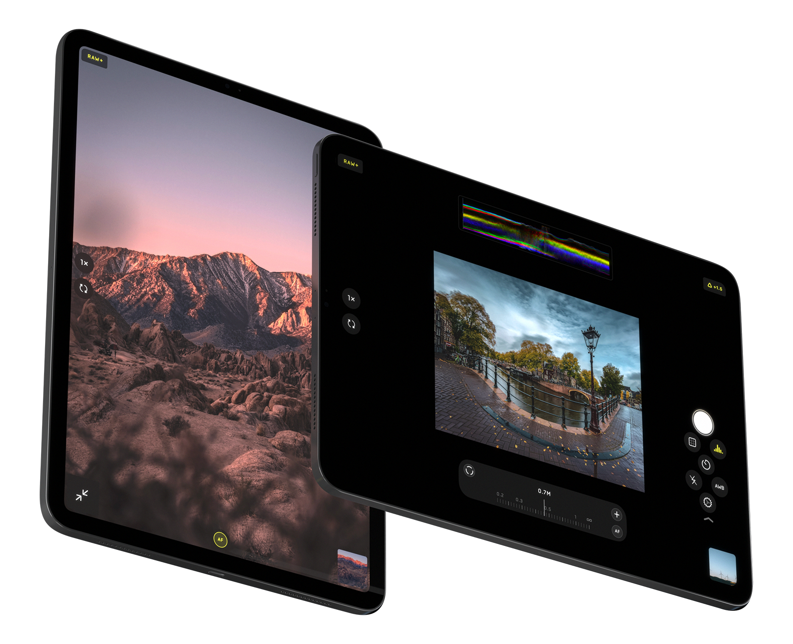
Meet Halide for iPad. Packed with all the powerful features of Halide for iPhone and a few special ones for better photography on big screens.
Enjoy the brand-new, completely custom iPad interface and features like Pro View to get a scaled-down, unobstructed view of your shot with plenty of space for your Pro tools and readouts.

Always up to date — now with iOS 18 Lock Screen Capture. Halide packs intuitive gestures, gorgeous details, and effortless ease of use.
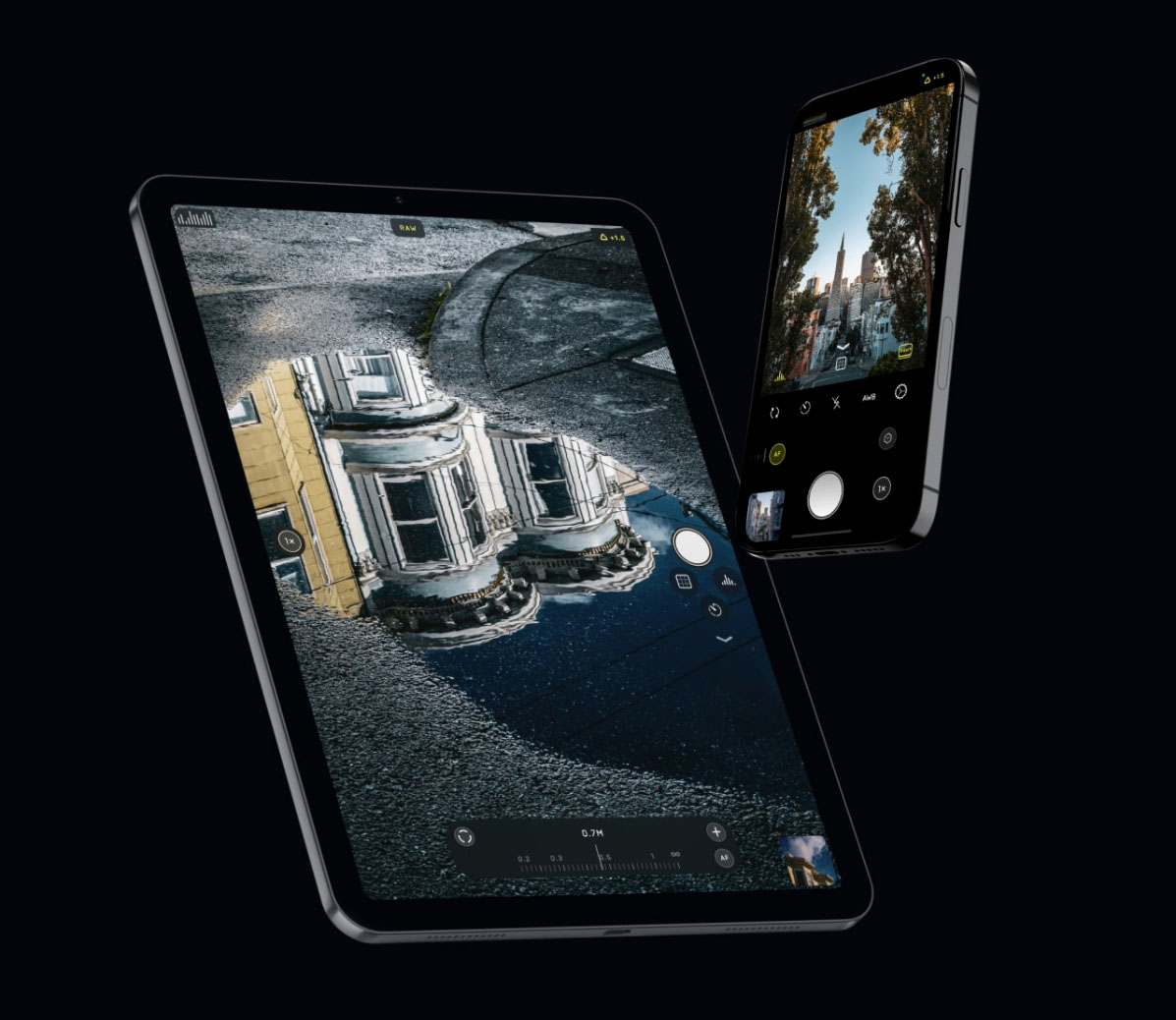
Designed to be used with one hand on all phones without compromising on power.
New in Mark II: Edge gestures for mode switching. Tactile Touch enables and disables focus and exposure aids as you need them. Designed with three new, custom typefaces.
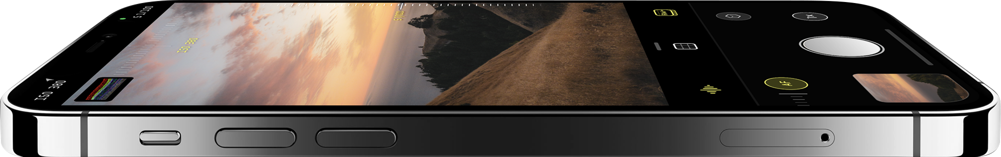
Halide Mark II packs the best pro camera tools on the App Store.
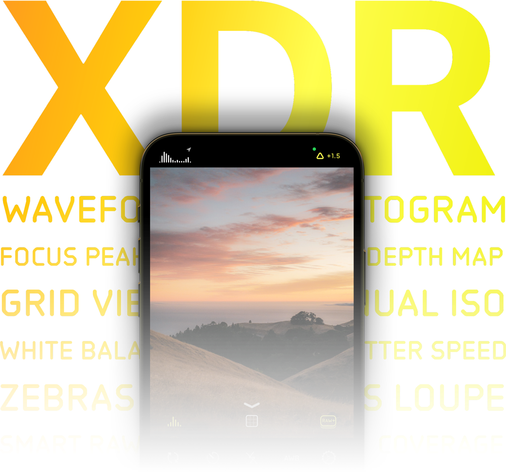
Check for accurate exposures with the new extended dynamic range (XDR) 14-bit color zebras and waveforms.
Use your ideal histogram with large and small displays featuring monochrome and color options. Perfect manual focus with automatic enhanced focus peaking and a new focus loupe.
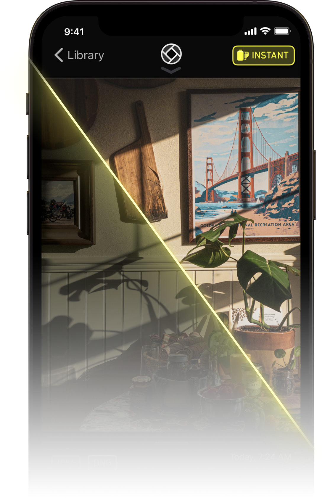
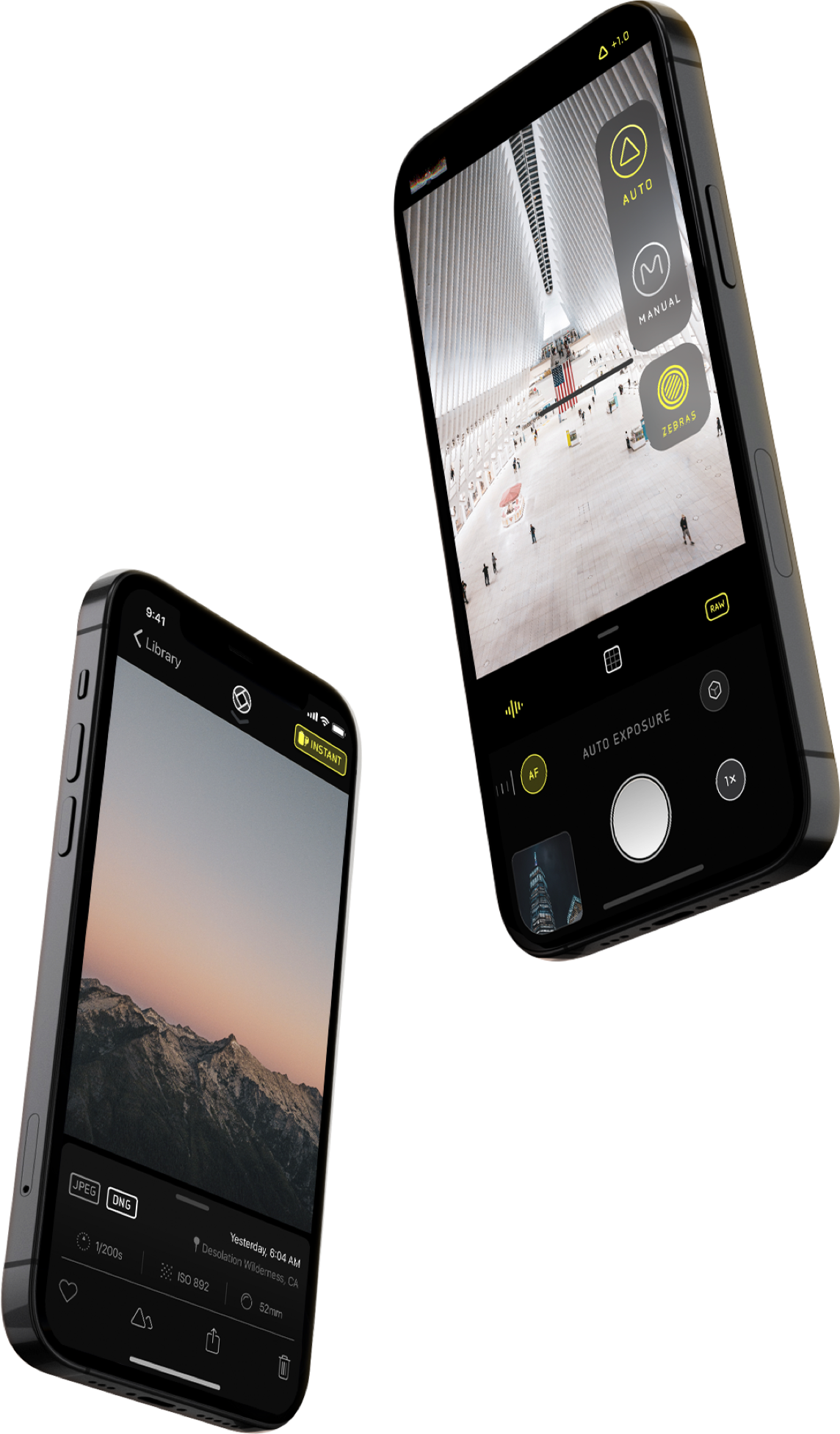
You might love your iPhone's super-smart, AI based image processing, or you might not.
That's why Halide lets you pick your processing — even between shots. Choose from iPhone's default image processing, or reduced processing, or choose Process Zero: a single-shot RAW capture mode that gives you beautiful film-like shots with minimal processing and zero AI right out of the camera.
The new Image Lab lets you re-develop the shot later for different exposures, or you can edit your photo in an image editor with huge flexibility — because Halide saves raw sensor data along with your shot.
Halide was designed with our favorite object in mind: the delightfully tactile and beautiful film camera, without compromising on the flexibility and power of mobile photography.
Gestures are modeled after the intuitive manipulation of dials: swiping up and down for exposure, and left and right for focus. The interface is simple and free of clutter, letting you focus on your artistic process.
We pay homage to the design heritage of more than a century of camera design with completely custom typefaces and typography throughout based on etched type on camera bodies and lenses.
: High visual mass with thickened silhouettes, ideal for drawing public attention. : Best used for primary headings and subheadings to create a strong visual hierarchy. CSS Implementation : Typically corresponds to a font-weight or higher. 2. Conceptual Design Piece Theme: Modern Global Connectivity Header (Winsoft Pro Bold) : "INNOVATING ACROSS BORDERS" Note: Use all-caps for a modern, authoritative look. Sub-header (Winsoft Pro Medium) : "Solutions for the Multi-Lingual Enterprise" Body Copy (Winsoft Pro Regular)
WinSoft Pro Bold is a heavyweight, highly legible typeface specifically engineered for complex multilingual desktop publishing and digital layout environments. Developed by WinSoft—a software pioneer renowned for adapting Adobe products for Middle Eastern and international markets—this font family was created to solve a persistent design problem: ensuring seamless typographic harmony between Latin characters and non-Latin scripts.
: It is often described as a calligraphic and elegant typeface, modeled after traditional letter-press hand-set Arabic fonts from the early to mid-20th century.
Whether you are a graphic designer working on a billboard, a software developer labeling a UI dashboard, or a financial analyst preparing an annual report, understanding the nuances of can elevate your work from "good" to "exceptional." This article explores every facet of this powerful font: its origins, technical specifications, ideal use cases, pairing suggestions, and licensing options. winsoft pro bold
Pairing a font with other weights from its own family guarantees perfect stylistic harmony. The proportions, x-height, and tracking will naturally match, creating a clean, cohesive, and hyper-modern look. The Editorial Contrast Pair Header: WinSoft Pro Bold Body Text: Georgia, Adobe Garamond, or Times New Roman
WinSoft Pro Bold is a premium, robust weight within the larger WinSoft Pro sans-serif typeface family. Developed primarily to meet the demanding needs of complex desktop publishing and multilingual design, this font is heavily associated with high-end formatting tools, particularly for OpenType layouts and multi-script documents.
As a sans-serif font, it strips away the decorative feet (serifs) found in traditional typefaces, offering clean lines, geometric stability, and an inherently modern aesthetic. The Bold weight specifically increases the stroke thickness of the letterforms, maximizing contrast against backgrounds and ensuring that text immediately draws the viewer's eye. Key Characteristics of WinSoft Pro Bold : High visual mass with thickened silhouettes, ideal
This comprehensive guide explores the origins, design anatomy, and practical applications of Winsoft Pro Bold, showing you how to leverage this powerhouse font to elevate your print and digital projects. What is Winsoft Pro Bold?
A bold typeface communicates stability, confidence, and forward-thinking. WinSoft Pro Bold is an excellent choice for tech startups, financial institutions, and modern lifestyle brands looking to anchor their wordmarks with a sense of permanence and trust. Editorial and Website Headlines
Ironically, despite being "bold," this font is often used for warning labels and safety instructions. The distinct shape of the letter 'I' (with serifs only on the top and bottom) and 'l' (with a curved foot) ensures that technical codes are never misread. For example, the number 1 and lowercase l are unmistakably different. it is a global communication tool.
When a typeface is pushed to a weight, it risks losing clarity. Letters can become muddy, counters (the enclosed spaces inside letters like 'o' or 'p') can fill in, and the overall rhythm of the text can degrade.
I can provide or specific font pairing recommendations tailored exactly to your design goals. Share public link
The true strength of the WinSoft Pro family lies in its advanced OpenType architecture. WinSoft Pro Bold is not just a western font; it is a global communication tool. Script Support

© Rowan's Sail 2026. All Rights Reserved.